I led content design for TikTok's screen time dashboard, creating clear, actionable insights that helped users understand their usage patterns. The dashboard achieved a 12x increase in unique views and 3.9x increase in adoption rate—proving that wellbeing features don't have to feel like punishment when designed with empathy and clarity.
TikTok faced a challenge common to all social platforms: users wanted more control over their screen time, but existing features went largely unused. Internal studies showed people didn't understand how much they used TikTok, which made it nearly impossible to manage their time effectively.
The business stakes: TikTok needed to demonstrate commitment to user wellbeing (especially for younger users) while maintaining engagement. Wellbeing features that nobody used wouldn't satisfy regulators, parents, or users themselves.
The opportunity - design a dashboard that satisfied three competing needs:
User awareness: Help people understand their actual usage patterns
Business retention: Position TikTok as a responsible platform that supports healthy usage
Competitive parity: Match features offered by Instagram, YouTube, and other platforms
Who I was designing for: TikTok users who wanted to understand their screen time habits but felt overwhelmed by numbers without context.
What they needed:
Clear visualization of time spent and frequency of app opens
Ability to compare different time periods to spot patterns
Breakdown by day vs. night usage to understand when they used TikTok most
No judgment—just information to make their own decisions
Research showed that compulsive app usage interfered with sleep, work, and relationships (Europe PMC), but that self-insight could lead to behavioral change (Human-Computer Interaction Research). Users wanted transparency, not lectures.
My responsibilities:
Led content design for the screen time dashboard feature
Designed all dashboard labels, descriptions, and help text
Collaborated with product design, engineering, data science, localization, and linguistics teams
Recommended terminology changes based on competitive research and TikTok's voice guidelines
The challenge: Transform complex usage data into insights users could actually understand and act on—without making them feel guilty about their choices.
Benchmarking competitors and platforms:
I researched how other apps approached screen time dashboards.
iOS native Screen Time (the gold standard)
Instagram's "Your Activity"
YouTube's "Time watched"
Facebook's usage tools
I shared findings with the product team to align on what users expected and where TikTok could differentiate.
Solving the terminology challenge:
One of my biggest contributions was recommending we change the section name from "Digital Wellbeing" to "Screen time." Here's why:
"Digital Wellbeing" problems:
Sounded preachy and judgmental
Didn't clearly communicate what the feature did
Poor alignment with TikTok's conversational voice
"Screen time" advantages:
Users already understood this term from iOS
Neutral and informational, not prescriptive
Matched competitor terminology
Better fit with TikTok's style guide (inclusive, approachable, conversational, clear)
I supported this recommendation with insights from a conference on problematic media use and competitive research showing consistent terminology across platforms.
Designing for clarity and actionability:
I worked closely with the product designer to create content for the dashboard that balanced detail with simplicity:
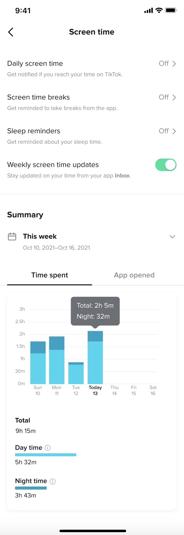
Summary header: "This week" with date range (e.g., Oct 10, 2021–Oct 16, 2021)
Primary metrics: Time spent vs. App opened tabs with clear data visualization
Contextual details: Hover states showing "Total: 2h 5m" and "Night: 32m"
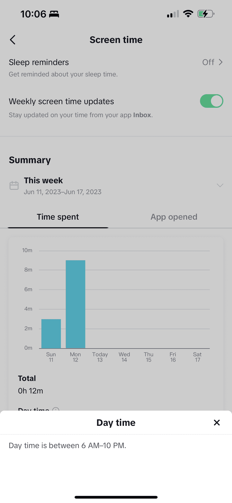
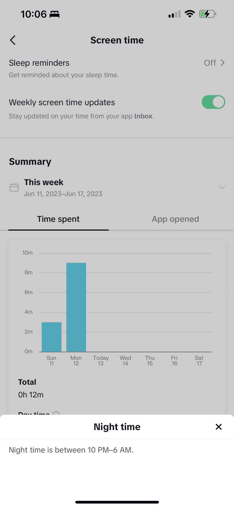
Breakdown sections: Total time, Day time, Night time with definitions
Week selector: Easy navigation between time periods
Throughout, I engaged engineering, localization, and linguistics teams early to identify potential roadblocks before finalizing content—avoiding costly late-stage rewrites.
Dashboard adoption exceeded all targets:
12x increase in unique views of the "Screen time" screen and dashboard, far exceeding the initial target
3.9x increase in the screen time dashboard adoption rate, far exceeding the initial target
Related feature adoption increased:
73% increase in adoption of the existing "Daily screen time" feature, driven by the introductory push notification that brought more traffic to the Screen time section
Media recognized TikTok's commitment to wellbeing:
The screen time dashboard contributed to positive press coverage.
"Amid growing concerns around app addiction, TikTok rolls out more screen tools" (TechCrunch)
"TikTok can now help stop your infinite scrolling" (The Verge)
User-friendly terminology: Changing "Digital Wellbeing" to "Screen time" made the feature immediately understandable. Users knew what to expect before they even opened it.
Information, not judgment: The dashboard presented facts—time spent, frequency of opens, day vs. night patterns—without telling users what to do. This respect for user autonomy made the feature feel helpful, not preachy.
Competitive alignment with TikTok differentiation: By matching terminology users knew from other platforms while maintaining TikTok's conversational voice, we made the dashboard both familiar and on-brand.
This project taught me that the best wellbeing features don't lecture—they inform and empower.
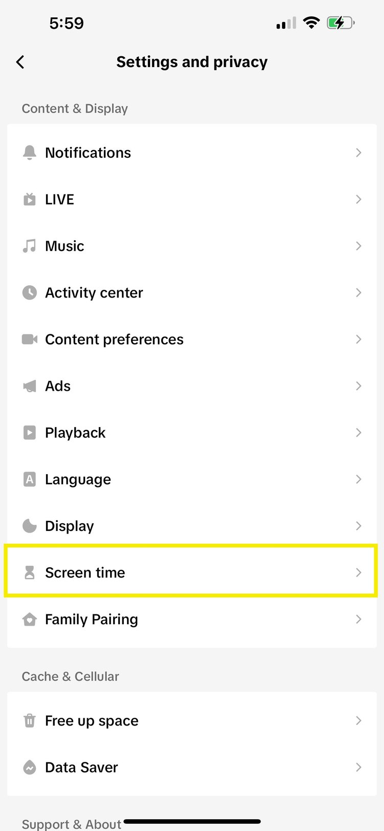
Making it discoverable: Users access the dashboard through Settings and privacy > Screen time, positioned prominently in the Content & Display section.
—>

At-a-glance understanding: The "Time spent" tab shows daily usage patterns with hover states revealing total and nighttime usage—helping users spot concerning patterns.
—>
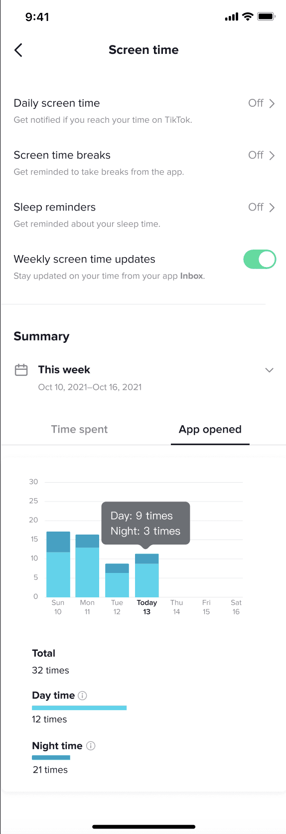
Beyond just time: The "App opened" view shows how often users launch TikTok (e.g., "Day: 9 times, Night: 3 times"), revealing compulsive checking habits that time alone wouldn't show.
—>
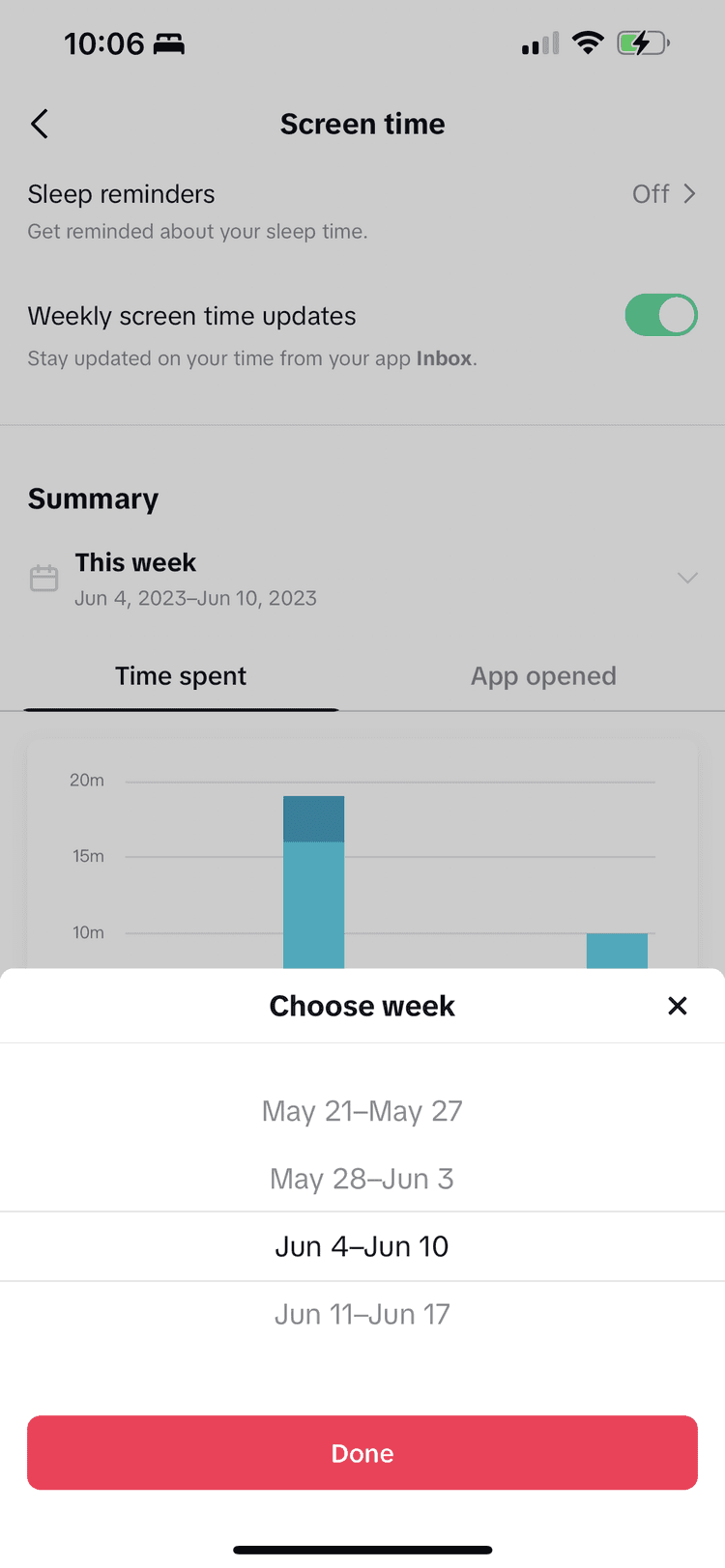
Detailed breakdown with helpful context: Users can compare different weeks and see day vs. night splits (defined as "6 AM–10 PM" and "10 PM–6 AM"), giving them specific insights to act on.
—>
Sheet
—>
Sheet
—>
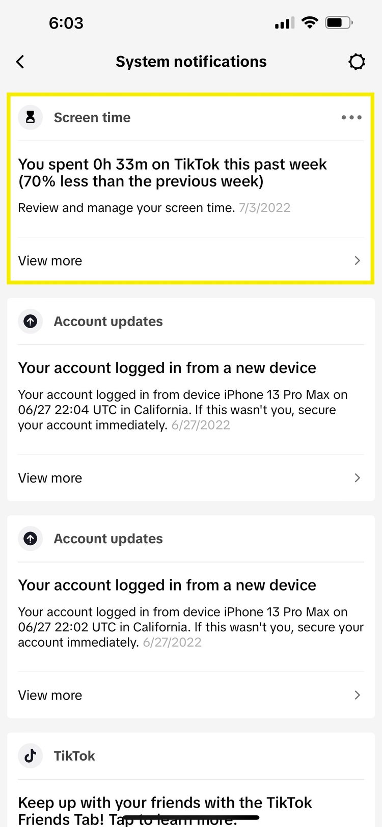
Proactive awareness: Weekly push notifications ("You spent 0h 33m on TikTok this past week—70% less than the previous week") drive users back to the dashboard and celebrate positive changes.
✓