
I led content strategy for TikTok's daily screen time feature, advocating to remove restrictive language like "limit" in favor of empowering language about "valuable usage." This shift in framing increased adoption by 55% for minors and drove 6.4x growth in daily active users—proving that how you say something matters as much as what you're saying.
Who I was designing for: TikTok users who wanted more control over their usage but didn't respond well to language that felt limiting or judgmental.
What they needed:
Tools to set their own boundaries (not imposed limits)
Awareness of when they were approaching their chosen time
Flexibility to continue if they chose to, not forced lockouts
Language that respected their autonomy and decision-making
Internal studies showed people weren't aware of their usage patterns. Research showed that self-insight could lead to behavioral change, but only if users felt empowered, not restricted.
TikTok needed to help users—especially minors—manage their screen time, but internal research showed people weren't aware of how much time they spent on the app. Some users spent more time than they wanted, which interfered with work, school, family, and sleep.
The business stakes:
Regulatory pressure: Governments and parents wanted TikTok to demonstrate responsibility for youth wellbeing
User trust: Research showed 6+ hours of daily screen usage correlated with higher depression risk (National Library of Medicine) and that children spending 7+ hours on screens showed brain changes affecting critical thinking (National Institute of Health)
Competitive parity: Instagram, YouTube, and iOS already offered screen time tools—TikTok needed to match or exceed them
The challenge: Design a feature that helped users set boundaries without making them feel punished, restricted, or lectured.
My responsibilities:
Led content design for the daily screen time feature
Designed all dashboard labels, descriptions, and help text
Collaborated with product design, engineering, data science, localization, and linguistics teams
Recommended terminology changes based on competitive research and TikTok's voice guidelines
The challenge: Transform complex usage data into insights users could actually understand and act on—without making them feel guilty about their choices.
What I was working with:
Sensitive user group: Minors were the primary audience, requiring extra care in messaging to avoid feeling patronizing or controlling.
Stakeholder concerns: Product and policy teams initially wanted strong language about "limits" to signal TikTok's commitment to safety.
Competitive benchmarking: Other platforms used "time limit" language—we needed to differentiate while remaining familiar.
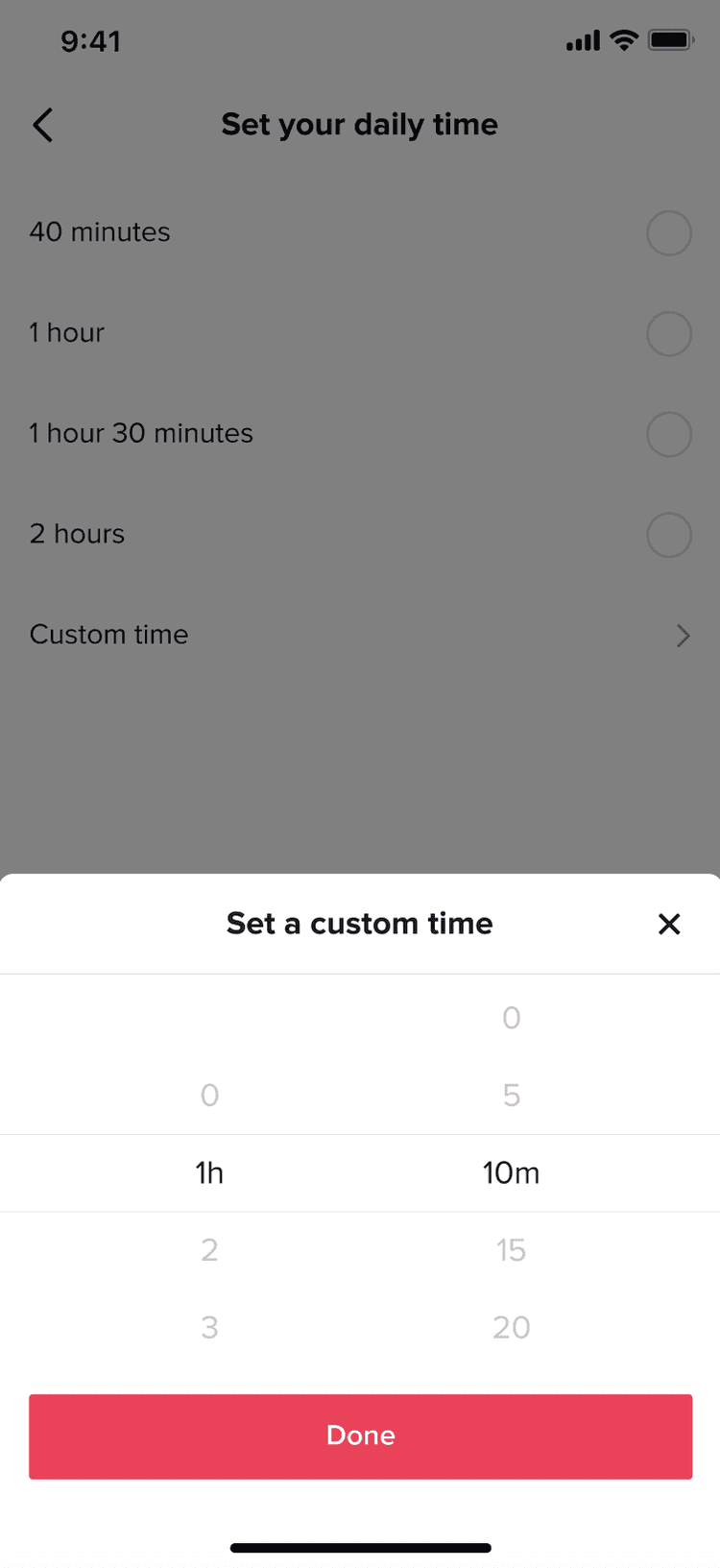
Technical constraints: The feature needed to allow users to set custom times (40 min, 1 hour, 1.5 hours, 2 hours) with intervention screens when time was reached, but users could choose to continue with a passcode.
Developing subject matter expertise:
I attended a conference on problematic interactive media use led by Boston Children's Hospital. This helped me shape the direction of the feature and influence TikTok's broader screen time product strategy.
Key insight I brought back:
"Avoid language that evokes screen time limits. We hear a lot about screen time limits, but no one wants to be limited. Instead, it's about valuable media usage vs. invaluable usage."
This became my north star for the messaging strategy.
Convincing stakeholders to change the language:
The biggest challenge was convincing the product team, communications, and policy stakeholders that removing "limit" from our UI language would be worthwhile.
My argument:
Research showed people respond better to empowerment framing than restriction framing
"Limit" implies we're restricting users, which creates resistance
"Set your daily time" or "manage your screen time" positions users as in control
This aligned with our broader goals: help people have more control and agency over their screen time behavior, without glaring restraints
The result: Stakeholders agreed. We removed "limit" from all UI language and focused on user choice and awareness instead.
Designing the feature flow:
I worked closely with the product designer to create content for the entire experience:
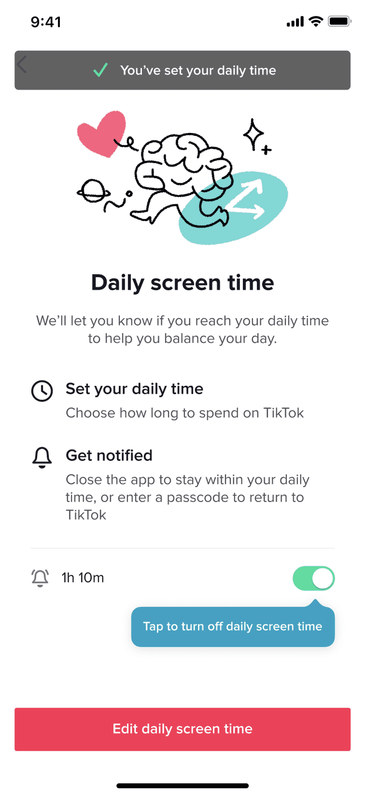
1. Feature introduction screen:
Title: "Daily screen time"
Description: "We'll let you know if you reach your daily time to help you balance your day"
Two options: "Set your daily time" and "Get notified"
Empowering, not restrictive
2. Time selection:
Options for 40 minutes, 1 hour, 1 hour 30 minutes, 2 hours, or custom time—giving users full control
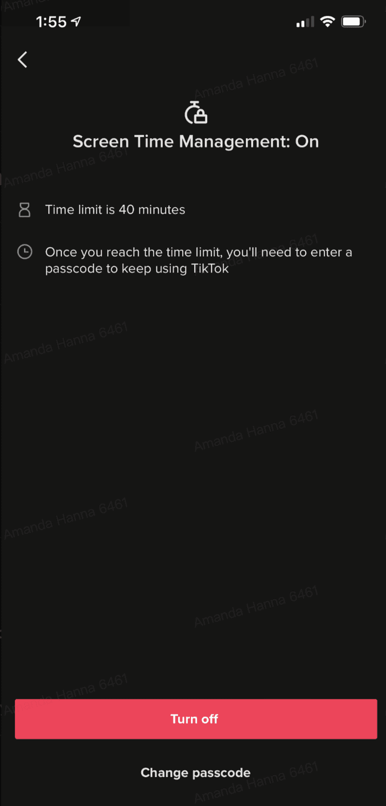
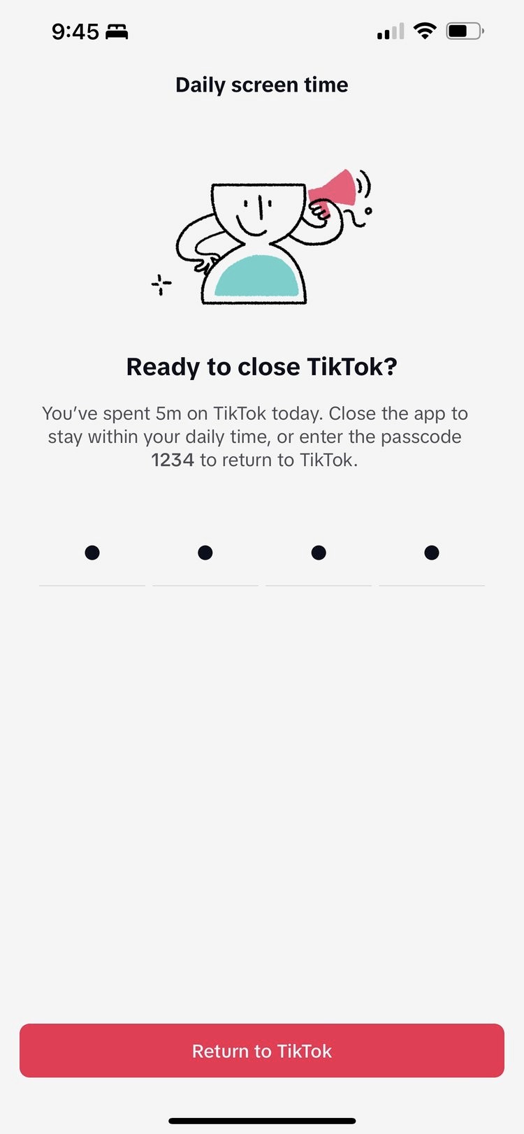
3. Intervention when time is reached:
Title: "Ready to close TikTok?"
Message: "You've spent 5m on TikTok today. Close the app to stay within your daily time, or enter the passcode 1234 to return to TikTok."
Note: Users can choose to continue—it's a nudge, not a lockout
4. Settings visibility:
Before my work, the feature was buried under "Digital Wellbeing" (which felt preachy). After advocating for the section rename to "Screen time," I ensured "Daily screen time" was prominently placed at the top of the list—making it discoverable and non-judgmental.
Feature adoption exceeded all targets for minors:
55% increase in adoption rate for users under 18—the key demographic for Trust & Safety
50% increase in overall under-18 safety tool adoption rate, with 99.7% driven by the screen time default for minors (a feature with high significance to TikTok becoming a trusted brand)
Overall engagement grew across all screen time features:
6.4x increase in daily active users for the "Daily screen time" feature, driving user awareness and trust
75% increase in daily active users across all screen time features
154% increase in daily active users for people under 18 across all screen time features
The feature scaled from lightweight to industry-leading:
Scaled screen time from one lightweight feature to an industry-leading suite of wellbeing tools, exceeding targets for awareness.
68 million page views
100+ million PR impressions
19.2 million daily active users (up from 1.5 million)
Media recognized TikTok's leadership in youth safety:
"TikTok Sets Default Daily Screen Time Limit For Under 18s" (Forbes)
"TikTok expanding time limits on app" (Axios)
One word changed everything: Removing "limit" and replacing it with empowering language ("set your daily time," "manage your screen time") completely reframed how users perceived the feature. Instead of feeling restricted, they felt supported.
Conference insight shaped strategy: Attending the Boston Children's Hospital conference gave me research-backed language to use when advocating for the change. "Valuable usage vs. invaluable usage" became the framework that convinced stakeholders.
User autonomy drove adoption: By designing interventions that nudged but didn't force (users could enter a passcode to continue), we respected user choice while still providing awareness. This balance was critical for minor adoption.

Settings (before)
—>
Settings (before)
—>
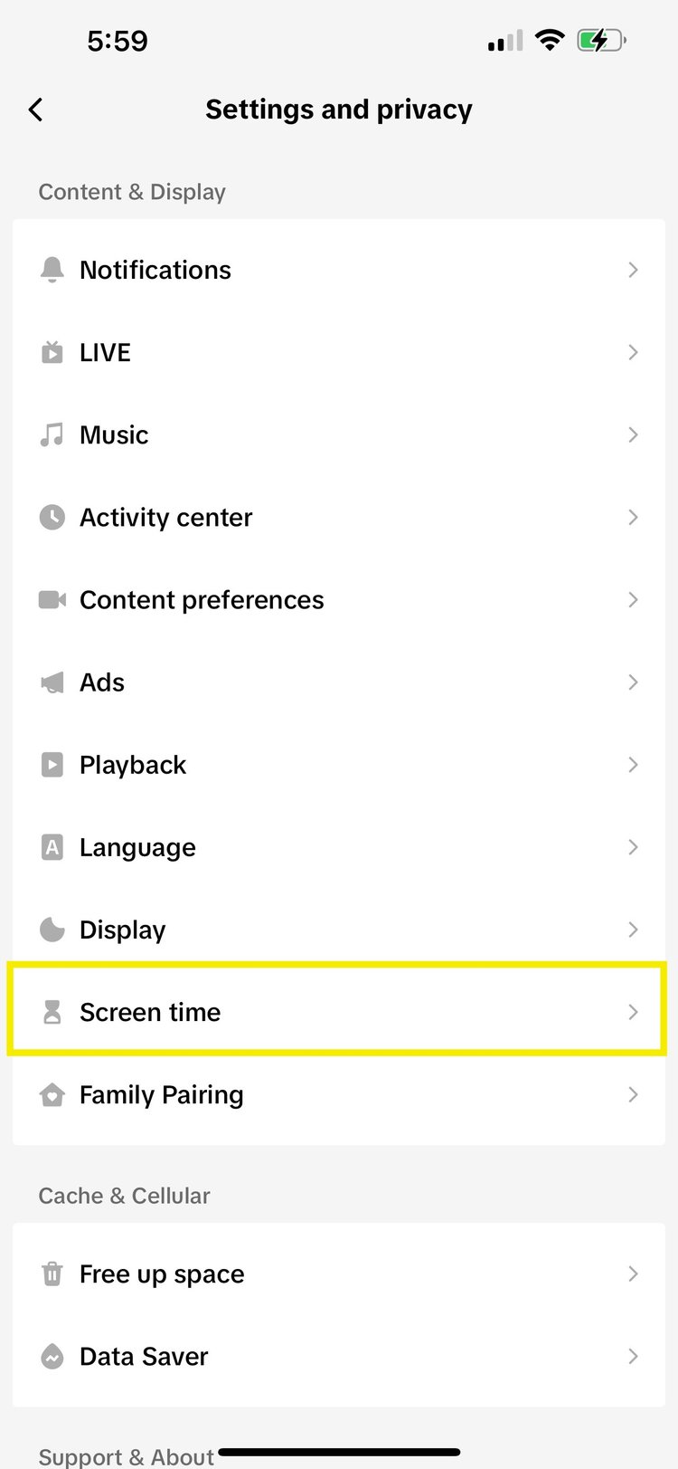
Making it findable: Changed the section name from "Digital Wellbeing" (preachy) to "Screen time" (clear).
—>

Making it findable: Placed "Daily screen time" at the top of the list for maximum visibility.
—>
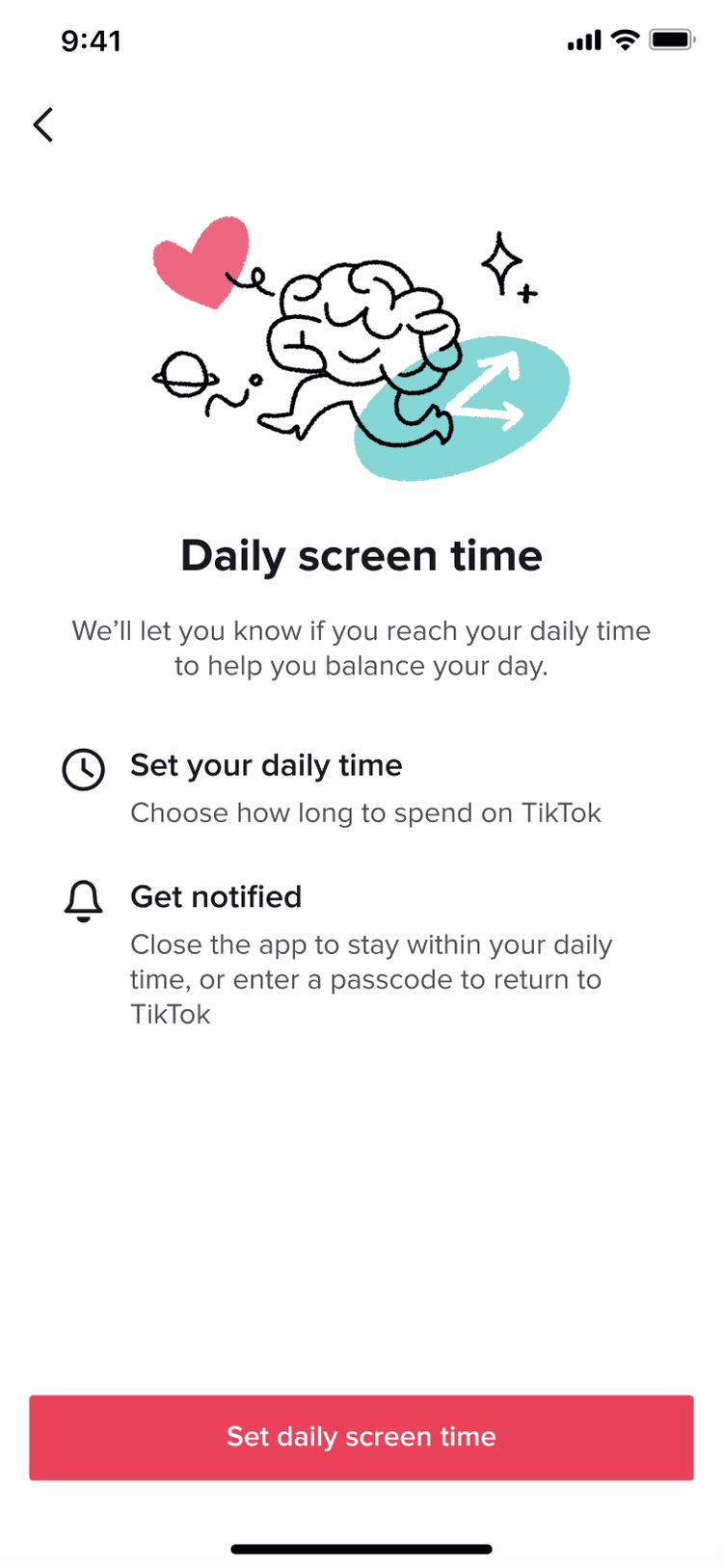
Empowering language from the start: "Set your daily time" (not "Set your limit") and "We'll let you know if you reach your daily time to help you balance your day" (not "We'll restrict your usage").
—>
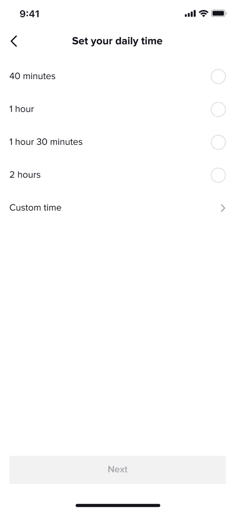
Full user control: Users choose from preset options (40 min, 1 hour, etc.) or set custom time—reinforcing autonomy.
—>
Feature
—>
Toast and tooltip
—>

Settings
—>

Gentle intervention, not lockout: "Ready to close TikTok?" with option to enter passcode and continue—respecting user agency while providing awareness.
—>
Intervention
✓